An illustrator and designer who works in a variety of mediums but has gained serious notoriety with his bold wood block type posters. Beautiful typography and strong use of colour.
We must have the truth.
This was a collaborative piece with designer Michael Marriott. It was exhibited in Milan this year at Graphic Design Worlds. An exhibition on graphic design illustrating its potential as an art. This particular instillation reminded me of the work of artist Christopher Wool.
I am lead to believe that this painting is quoting a social comentry and was created 20 years before Burrill and Marriott's collaboration.
Noma Bar is primarily a Graphic Designer and illustrator living and working in London. He uses negative space to create witty, striking images. What is partially interesting about Bar is that he refers to his craft as 'visual communication'. His work spans much more than just graphic design. As seen at his show at Outline Editions. Bar has designed and had made an electrically powered die-cutter.
Here are some examples of Bar manipulating easily
recognisable shapes and symbols in order to create
Last week I attended a lecture by Steve Millbourne and Phil Clandillon,
creative directors of Foam. Foam is an agency providing the most creative
approaches to promotion. They look at the market research of the chosen
demographic and construct a stunning and adventurously unconventional
piece of advertising around it.
An example that seems out there but is actually perfectly logical is the
AC/DC music video they had programmed to play in excel (yes thats right
on a spread sheet!).
Foam worked out that AC/DC fans where mostly men in there 30/40s who
worked in offices and wouldn't have access to sites such as youtube at work
but would be likely to have e-mail and excel.
The highlight of their work for me was their approach to designing posters for the
band Dry the River. Conventionally they would print 1000 posters that would get
little additional publicity and weren't going to set them apart from other up and
coming bands.
Foam went for a 'less is more' approach in deciding to make just five beautifully
hand crafted posters. In a digital age do we really need loads of physical objects if
500 people stop to take a picture for their blog? This project was hugely successful,
so when executed so well clearly not. In addition to the posters they also documented
the process behind creating them by making a video.
I am not exagarating when I say that the lack of limitations this company seem to
have and the effectiveness of their campaigns is nothing short of inspirational.
A designer from Ziggurat gave a lecture about how they liked
to design. He spoke with such enthusiasm about each company
as if they were old friends not briefs.
Ziggurat Brands root their design approach in story telling,
allowing the consumer to connect with the product on a
deeper level then simply visual appeal. I really like the
variation in the briefs they get and their responses to them.
Higgidy is a great example of Ziggurats use of story telling
in creating a brand.
Hands painted as animals,
fun, fresh and memorable.
Magazine advertisement.
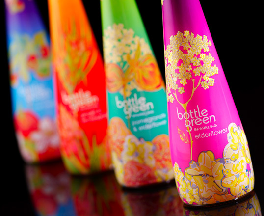
Limited Edition 2009
The limited edition designs where created by textile grad Rachel Pitman
originally using inks. The intensity of the colour and matt finish screams
high fashion and high end.
All the packaging designs I have posted have integrated image and
typography very effectively.