Sunday, 27 November 2011

James Greenfield

James Greenfield creative directer of Airside, gave a lecture at Nuca
today speaking about his career and roll as a creative. He spoke about 
how the roll has changed as a designer over the last ten years becoming
much more fluid dipping in and out of different aspects of the process
including helping to write the brief, thinking about the users experience
and changing disciplines to illustration, photography and animation
when necessary.


This is the branding for Green peaces plan to stop the building of the 3rd
run way at Heathrow. I remember seeing this a couple of years ago and 
thinking what an excellent idea. The type has been made to look like fields
by cutting the letter forms out of corrugated cardboard and using them to
print directly from. They have then been cleaned up on screen but the
process it's self screams Green Peace and just works.


Airside posted a lot of the process behind this project on there blog.

Vist their blog: play.airside.co.uk


Wednesday, 19 October 2011

Anthony Burrill

An illustrator and designer who works in a variety of mediums but
has gained serious notoriety with his bold wood block type posters.
Beautiful typography and strong use of colour.


We must have the truth.

This was a collaborative piece with designer Michael Marriott.
It was exhibited in Milan this year at Graphic Design Worlds.
An exhibition on graphic design illustrating its potential as an
art. This particular instillation reminded me of the work of
artist Christopher Wool.


I am lead to believe that this painting is quoting a social comentry
and was created 20 years before Burrill and Marriott's collaboration.


Hat-trick

Royal mail commissioned Hat trick to create a collection of stamps
 commemorating 50 years of the Royal Shakespeare Company.   


Such lovely sparing use of colour. The red really stands out without
detracting from the main imagery.  


Illustrator Marion Deuchars was asked to produce the handwritten lettering for
 the collection. The expressiveness communicated through the varying weight of
 the strokes gives personality to the thespians pictured and helps to give a tone of
voice to the famous lines.

Noma Bar

Noma Bar is primarily a Graphic Designer and illustrator living and working in
London. He uses negative space to create witty, striking images. What is partially 
interesting about Bar is that he refers to his craft as 'visual communication'. His work
 spans much more than just graphic design. As seen at his show at Outline Editions.
 Bar has designed and had made an electrically powered die-cutter.


Here are some examples of Bar manipulating easily
recognisable shapes and symbols in order to create 
new meanings.


Monday, 10 October 2011

Foam Agency

Last week I attended a lecture by Steve Millbourne and Phil Clandillon,
creative directors of Foam. Foam is an agency providing the most creative
approaches to promotion. They look at the market research of the chosen
demographic and construct a stunning and adventurously unconventional
piece of advertising around it.

An example that seems out there but is actually perfectly logical is the
AC/DC music video they had programmed to play in excel (yes thats right
on a spread sheet!).

Foam worked out that AC/DC fans where mostly men in there 30/40s who
worked in offices and wouldn't have access to sites such as youtube at work
but would be likely to have e-mail and excel.


The highlight of their work for me was their approach to designing posters for the
band Dry the River. Conventionally they would print 1000 posters that would get
little additional publicity and weren't going to set them apart from other up and
coming bands.

Foam went for a 'less is more' approach in deciding to make just five beautifully 
hand crafted posters. In a digital age do we really need loads of physical objects if
500 people stop to take a picture for their blog? This project was hugely successful,
so when executed so well clearly not. In addition to the posters they also documented
the process behind creating them by making a video.       


I am not exagarating when I say that the lack of limitations this company seem to
have and the effectiveness of their campaigns is nothing short of inspirational.  

Tuesday, 4 October 2011

Ziggurat Brands

A designer from Ziggurat gave a lecture about how they liked
to design. He spoke with such enthusiasm about each company
as if they were old friends not briefs.

Ziggurat Brands root their design approach in story telling,
allowing the consumer to connect with the product on a
deeper level then simply visual appeal. I really like the
variation in the briefs they get and their responses to them.

Higgidy is a great example of Ziggurats use of story telling
in creating a brand.


Hands painted as animals,
 fun, fresh and memorable. 

Magazine advertisement.
Limited Edition 2009

The limited edition designs where created by textile grad Rachel Pitman
originally using inks. The intensity of the colour and matt finish screams
high fashion and high end. 

All the packaging designs I have posted have integrated image and
typography very effectively.


Friday, 30 September 2011

Williams,Murray,Ham.

The group who brought us the first supermarket basics range that
didn't make you feel a little sad. Instead WMH enthersised that yes
it was cheaper but in fact a savvy consumer choice. No stigma just
handwritten product puns. The design reflects exactly what it is, a 
lower cost and slightly inferior but perfectly serviceable range of
products. The limited use of colour and plain white background
shows less margin for extravagant printing while staying in line
with the Sainsbury's brand. The hand drawn type is friendly and
intentionally doesn't look overly considered.   

Application of concept across a wide range of products.
Refuse Sacks
'Thinner not rubbish'


The puns are what makes this range so much less hostile than other 
supermarkets own ranges. It's very human and makes the consumer
feel a little better about not being able to afford the product above 
the own brand, which has become more of a issue over the last three
to four years.   

Pearlfisher

Specialising in branding and packaging Pearlfisher have created work for many
 top brands. Some of these brands we recognise because of Pearlfisher in fact.


Pearlfisher approached the Green and Blacks founder to convince them that a rebrand would help then differentiate their products from others in a crowded arena. The consequence of this rebrand ultimatly was a 789% increase in market share for G&B and a DBA Design award for Pearlfisher.

Pearlfisher needed to reposition the brand using the 'right tone of voice'. By this I mean not only did they need to retain clear fair trade labelling and highlight that it is organic but also tell the consumer that it's tasty and sophisticated.

Strong and precise use of colour was used to emphasis how cocoa-rich the product is by creating its own pantone brown in the same deep shape as the chocolate. This teamed with saturated Georgian colours (depending on the flavour) didn't only have shelf appeal but connotations of a rich luxurious product while still being stylish. Layering the type is meant to show quality and affluence, although I think the luxury comes from the choice of type choice Trajan Pro or similar. 
Pearlfisher where careful in avoiding sterilising the brand with too cleaner cut appearance. 
A clear success. 

YSP- Spanish artist Jaume Plensa


The Yorkshire countryside provides such a fantastic backdrop for sculpture. 
Mainly because it seems quite an unlikely space to be home to internationally
acclaimed artists and designers.

Contemporary artist Jaume Plensa, best known for The Crown fountain in Chicago
currently has an extensive exhibition at YSP. His work looks at the human form
and state of mind. His interest in the written word, music and its vibration clearly
has been influential. As most sculptures incorporated typography and poetry or 
movement and sound. The work has real presence and integrates itself into the 
landscape beautifully.
 

The Crown Fountain, Chicago. (2000)
29 Palms (2007)
17,000 letters make up  57 metres of poetry.
The artist invited you to 'caress' the work to
create chime like sounds.  
Alabaster Heads (2008/10)
The lighting highlighted each head
leaving the rest of the exhibition space
in darkness.   
In the midst of Dreams (2009)
El alma del Ebro

Friday, 26 August 2011

Michael Gillette (Graphic Artist)

The Welsh born illustrator has been working in San Franisco for over 12 years. His work still retains his memorable vintage style  combing Pop Art and British mod with imagination and skill.
Gillette created this identity and stationary design back in 2008. It draws from the art deco period but combines it with a bold colour choice and Gillette's unique but vintage inspired style. 
...and if you cant decide where you recognise this graphic artist
 from maybe you recognise this from Glastonbury? 
This illustration was originally commissioned to accompany an
 album review for Mojo Magazine. 


Wednesday, 24 August 2011

Mojo House (Entertainment marketing)

Due to the release of the film 'One Day' the cover of the book that started it all has changed to the film poster designed by Mojo House.   


The main image has been broken down in to 20 Polaroid  photos
 each dated in pencil the same day over a 20 year period.
This offers incite into the plot and is a more creative solution then seen on most modern film posters. 
  

Tuesday, 23 August 2011

Nikki Farquharson (Graphic Artist)

The London based illustrator studied for a degree in graphic design but has since become well known for her style of illustration. She often combines fashion photography and flamboyant colours with intricate fine liner work.
Mixed media for Missbehave Magazine.
  
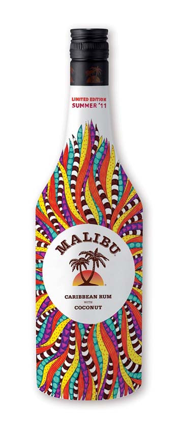
Limited edition Malibu bottle design for summer.
Vibrant and carnival-esc.   

Thursday, 21 July 2011

Maurizio Anzeri (artist)

Italian artist Maurizio Anzeri often uses embroidery threads to create large wig like sculptures, but its his mixed medium images that have really taken off. Anzeri minipulates found vintage photographs with needle work.

This strange mix has often been described as 'unnerving', but that and the way you want to create a back story for the characters is what makes his work so appealing.   


Embroidery on photograph

 Edith (2011)


Rebecca (2009)

The needle work creates
 a feathery bird like structure. 

fashion Illustration

I love fashion illustration...

The varying weight of the line...

And the vibrancy
and strength of colour.
Poster in Amsterdam.
Clean, clear and worth a picture.